
Formatting Context
页面的元素或是格式化上下文的一部分,或本身就是格式化上下文。
常见的格式化上下文包括:
- 块级格式化上下文(block formatting contexts)
- 内联格式化上下文(inline formatting contexts)
- 弹性格式化上下文(flex formatting context)
- 网格格式化上下文(grid formatting context)
构建不同的格式化上下文会影响其内部元素,其子元素都会按照相应特定的规则来展现。
BFC
BFC 定义
正如上文所说格式化上下文只是约定了自身与内部元素的展示规则。
这些规则据定了父子元素、兄弟元素等等元素之间在展示时相互影响。
BFC 一样,只是约定了一套规则,没有所谓的定义。
在 CSS2.1 规范 中,这套规则描述如下:
In a block formatting context, boxes are laid out one after the other, vertically, beginning at the top of a containing block. The vertical distance between two sibling boxes is determined by the ‘margin’ properties. Vertical margins between adjacent block-level boxes in a block formatting context collapse.
In a block formatting context, each box’s left outer edge touches the left edge of the containing block (for right-to-left formatting, right edges touch). This is true even in the presence of floats (although a box’s line boxes may shrink due to the floats), unless the box establishes a new block formatting context (in which case the box itself may become narrower due to the floats).
上述规则规定了 BFC 内部元素的排列方向为由上而下,由左至右。
兄弟元素之间的间距由 margin 定,上下毗邻块级元素 marign 会合并。
在这套对 BFC 规则描述中,没有提到但 BFC 却拥有的一个最大的特征(规则)是:
BFC 容器内部的元素无论如何不会影响容器外部的元素。
BFC 触发
最外层的的页面元素(即 html 元素)创建初始的块级格式化上下文。
- html 元素
- 浮动(float != none)
- 绝对位置元素(position: fixed, absolute)
- table 及其部分子属性( display: table, table-cell, table-caption, table-row, table-row-group, table-header-group, table-footer-group)
- 内联块级元素(display: inline-block)
- overflow 非默认
- flex 子元素
- grid 子元素
- display: flow-root
常见应用
由 BFC 常用于如下场景中:
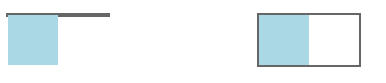
- 包含内部浮动元素(contain internal floats)
浮动的元素会脱离普通文档流,无法将容器撑开,将容器设定为 BFC 可防止其内部元素影响容器外部。
<h3>包含内部浮动</h3> |
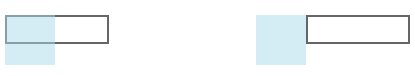
- 排斥外部浮动元素(exclude external floats)
<h3>排除外部浮动</h3> |
- 抑制边距合并(suppress margin collapsing)
margin 合并常被称为 margin 穿透。
同一个 BFC 内子节点下上外边距会发生合并,要抑制边距合并,可将子节点放在不同的 BFC 中。
HTML 根节点本身为就为 BFC,所以我们可以经常遇到 margin 穿透的情况。
<h3>margin穿透</h3> |

- 双栏及多栏布局
<h3>排除外部浮动</h3> |
display: flow-root
初始化一个块级元素,其内部采用流式布局,并且产生格式化上下文。
与 display: block 块级元素主要差别就是其内部采用格式化上下文的规则。
利用该方式产生 BFC 一般不会产生其它副作用。
从字面意思来说,其表明创造一个与根元素一样的流式布局元素。
BMW WARNING
- Bulletin
本文首发于 skyline.show 欢迎访问,
文章实时更新,如果有什么错误或不严谨之处望请指出,十分感谢。
如果你觉得有用,欢迎到Github仓库点亮⭐️。
I am a bucolic migrant worker but I never walk backwards.
- Material
参考资料如下列出,部分引用可能遗漏或不可考,侵删。
https://www.w3.org/TR/CSS2/visuren.html#block-formatting
https://developer.mozilla.org/en-US/docs/Web/Guide/CSS/Block_formatting_context
- Warrant
本文作者: Skyline(lty)
授权声明: 本博客所有文章除特别声明外, 均采用 CC BY - NC - SA 3.0 协议。 转载请注明出处!
[CC BY - NC - SA 3.0](https://creativecommons.org/licenses/by-nc-sa/3.0/deed.zh